

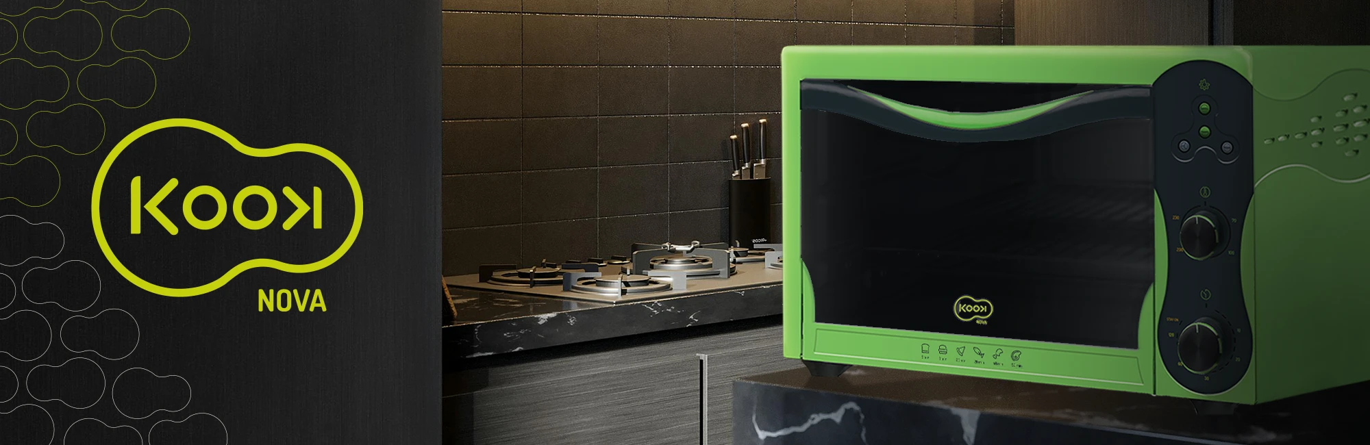
Electric Oven Design
UX/UI
Advertising
Iconography
CONCEPT
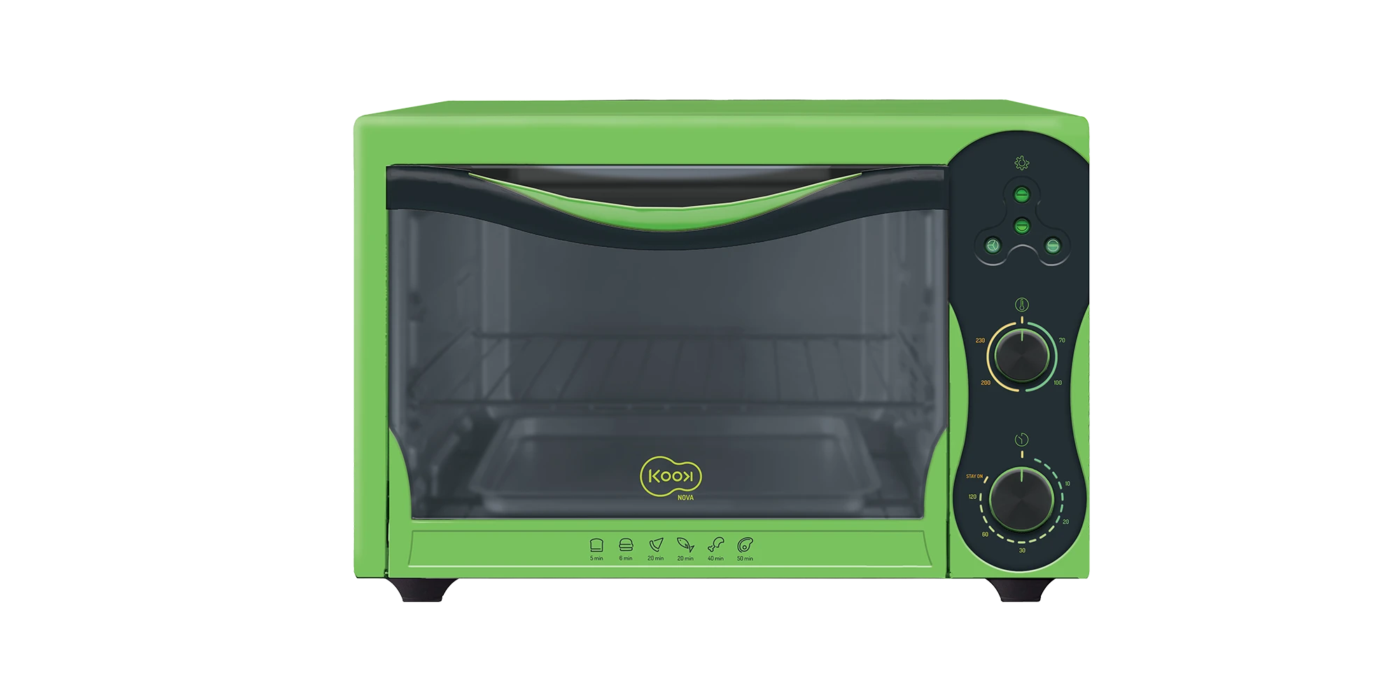
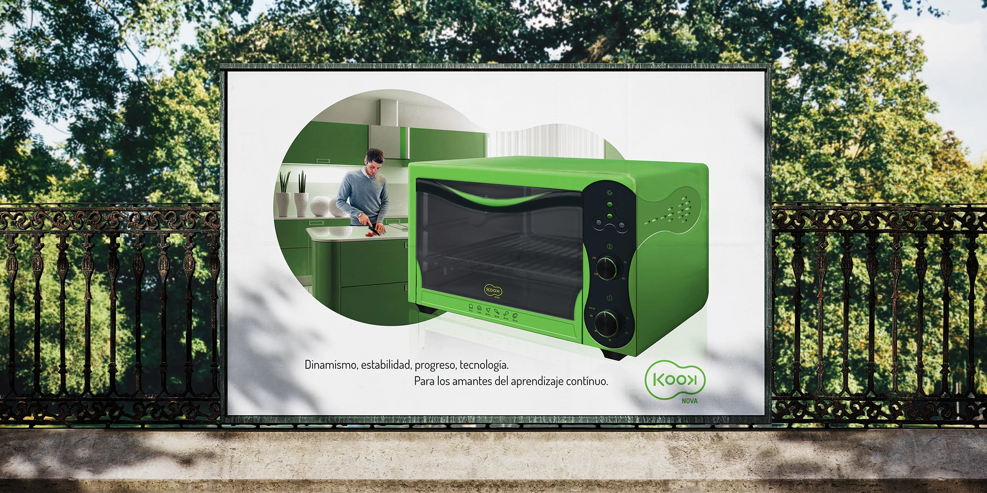
Aimed for young adults who try cooking for the first time and focused in an easy to follow cooking panel.
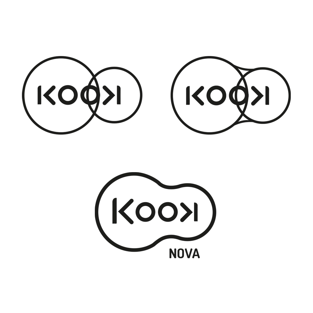
Kook: A Brand for the new adults
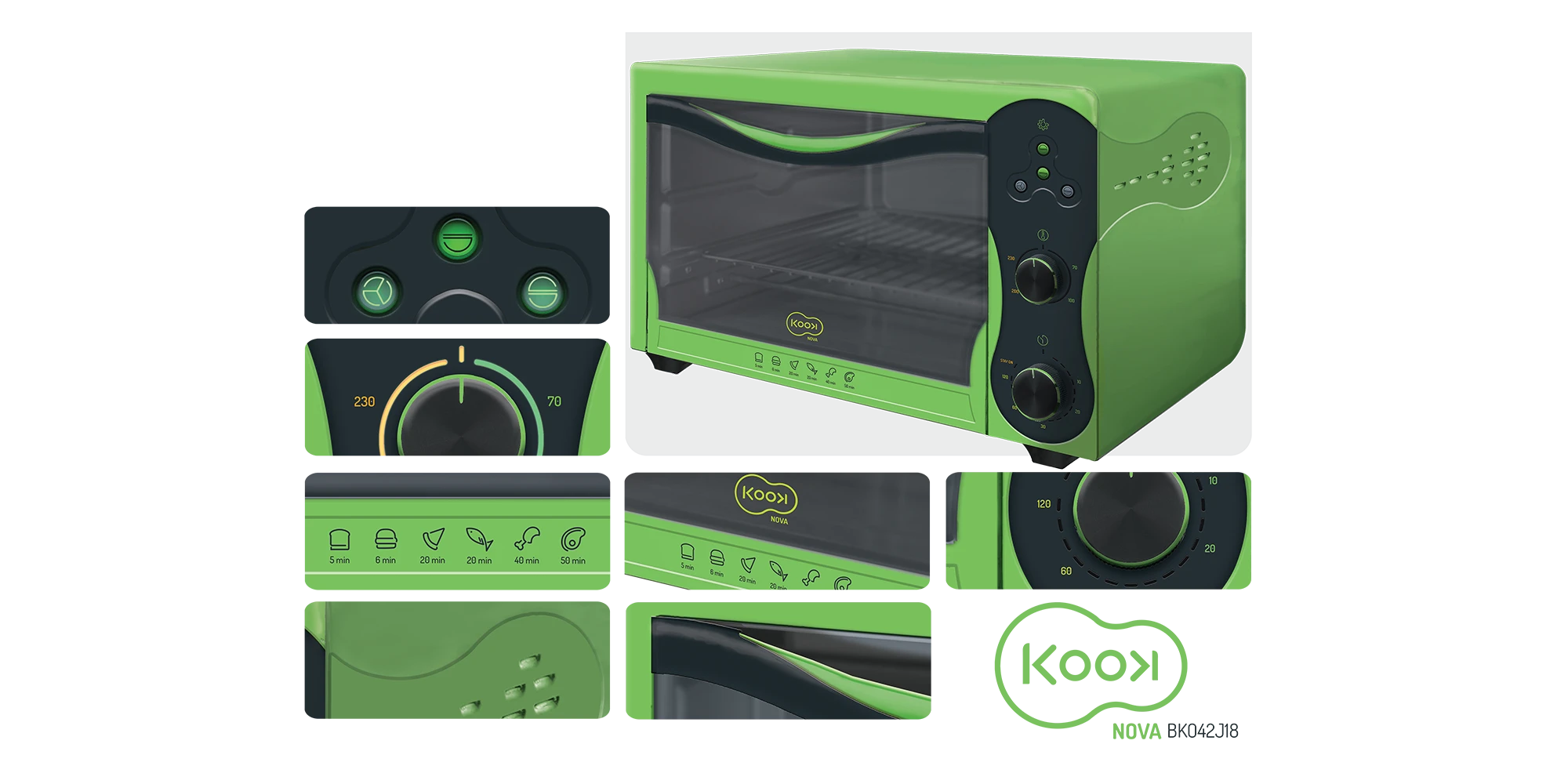
This brand is aimed at young people who are starting a new stage in life and moving out on their own. For this reason, special care was taken to develop a Easy to navigate and learn how to use electric oven.
The design takes inspiration from modern devices and consoles from the gaming universe, as a representation
of the 21st century adult and the continuous need to learn.
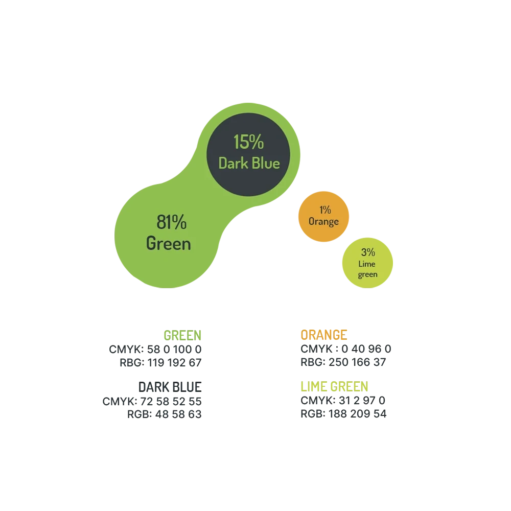
Key Colors and Shapes
Corporate colors blend in a futuristic, technological yet classy and traditional color range.
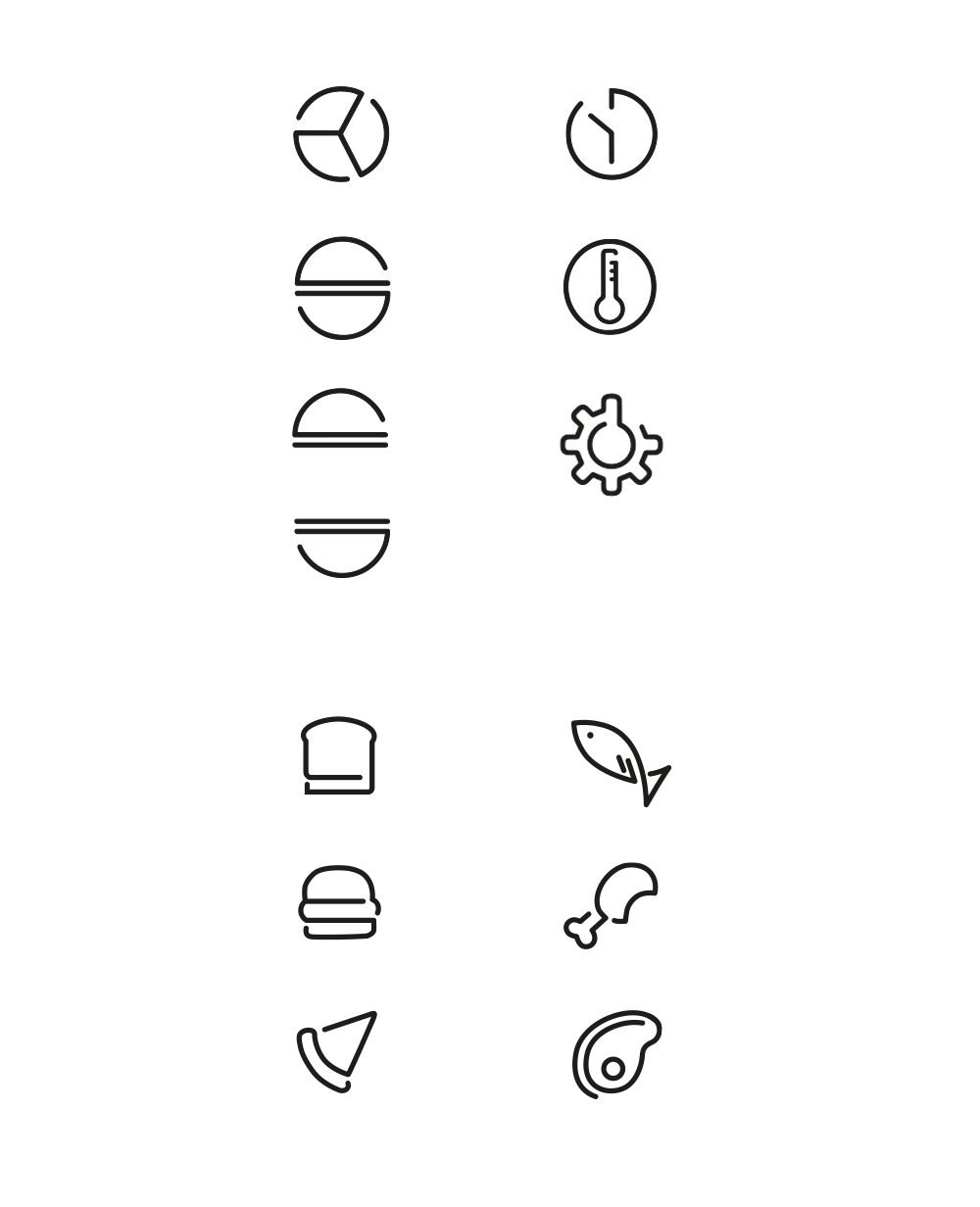
For the icons I have chosen constant thickness, that join without touching. to convey the message of a permanent learning cycle.
Ready for the chance to make your design request come true?

Book Collection design
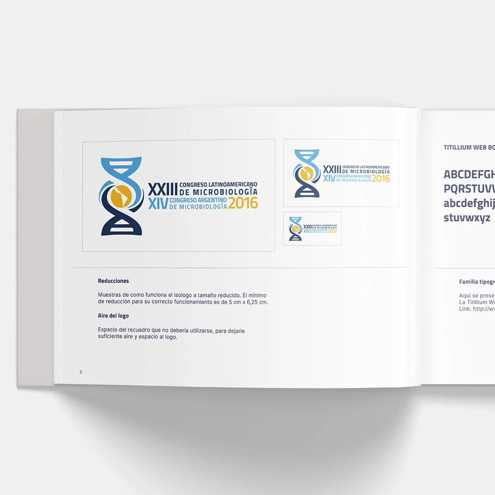
Microbiology Identity design